

Advisers spend hours at a time in AdviceDocs, reading drafts, checking figures and editing pages. The software around that work should stay out of the way. This month we redesigned both the website and the app with one goal: make AdviceDocs easier to look at, and easier to find your way around.
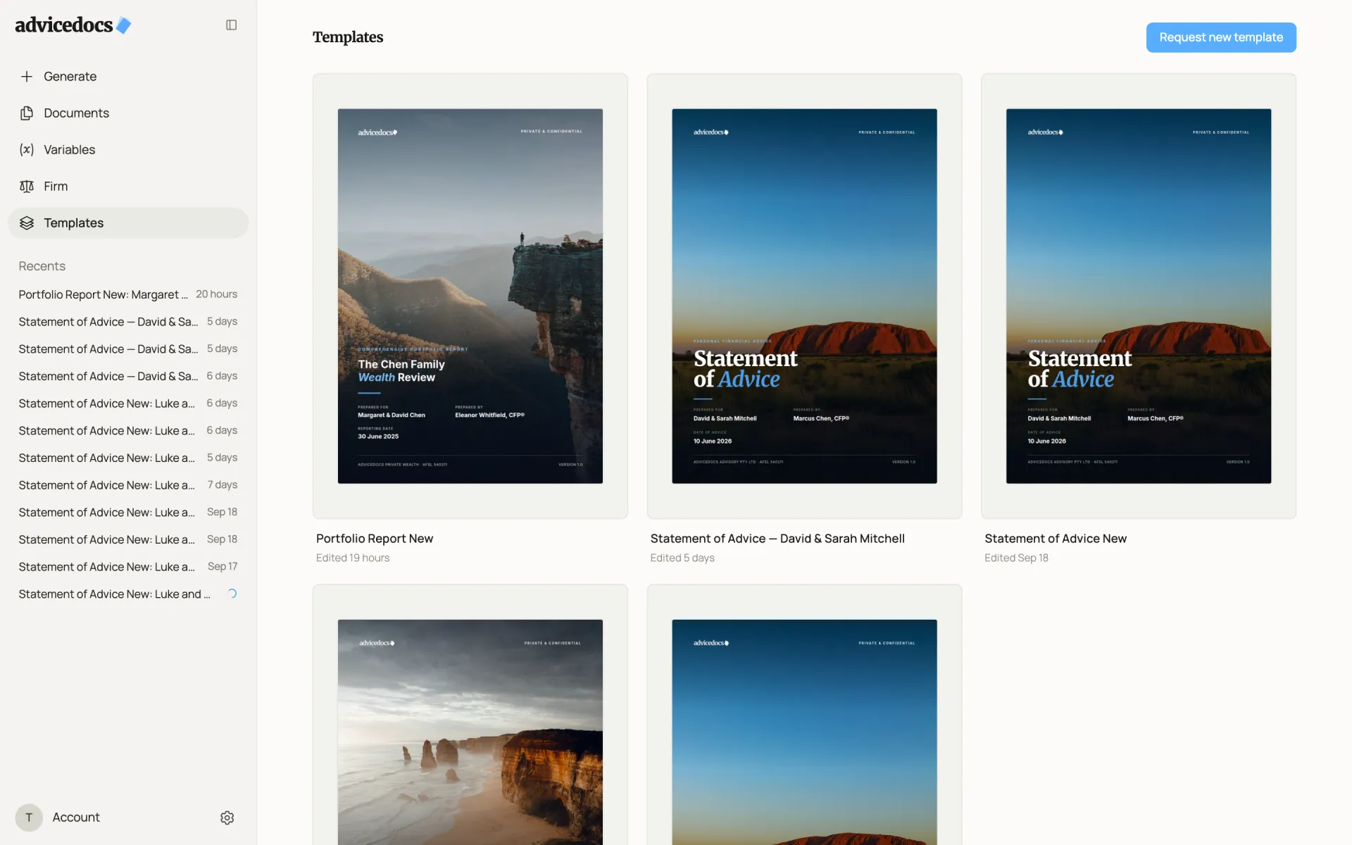
The redesign is visual and structural, not a change to what AdviceDocs does. Your templates, documents, variables and firm settings are exactly where you left them. What changed is how quickly you can get to them, and how calm the screen is while you work.
A clearer front door
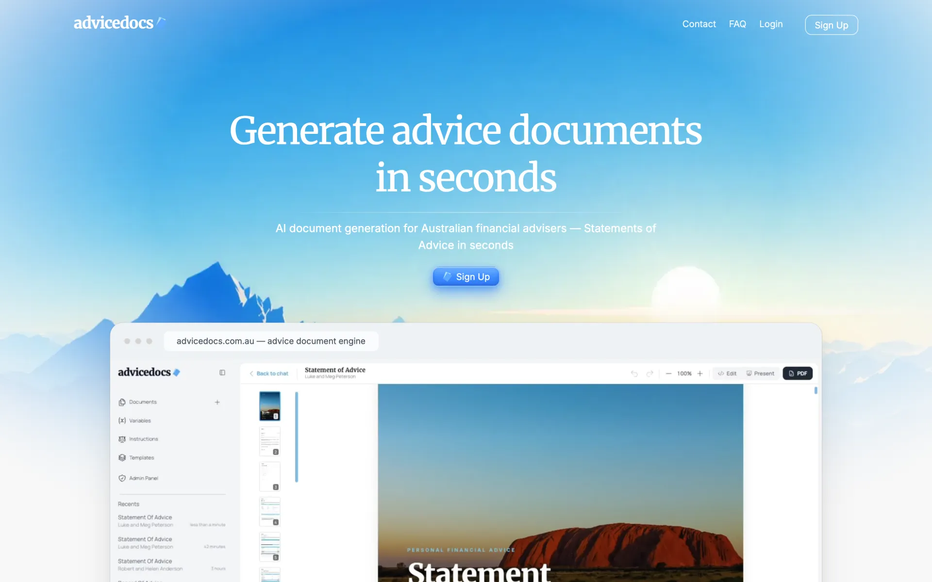
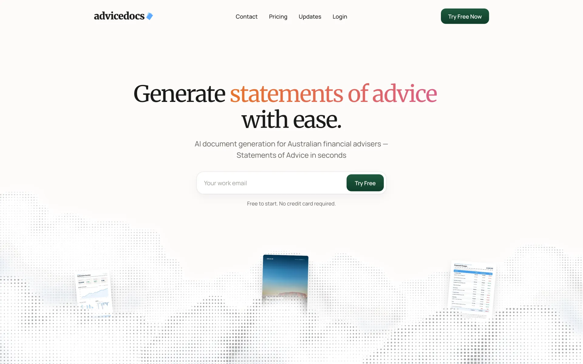
The old homepage opened on a bright sky-and-mountains image with a single Sign Up button. The new one is quieter and more direct: it says what AdviceDocs makes in one line, and lets you start a free trial by typing your work email right there, with no credit card. The header now links to a Pricing page and to these Updates, so you can see what AdviceDocs costs and what is new before you sign up.
Easier to find your way
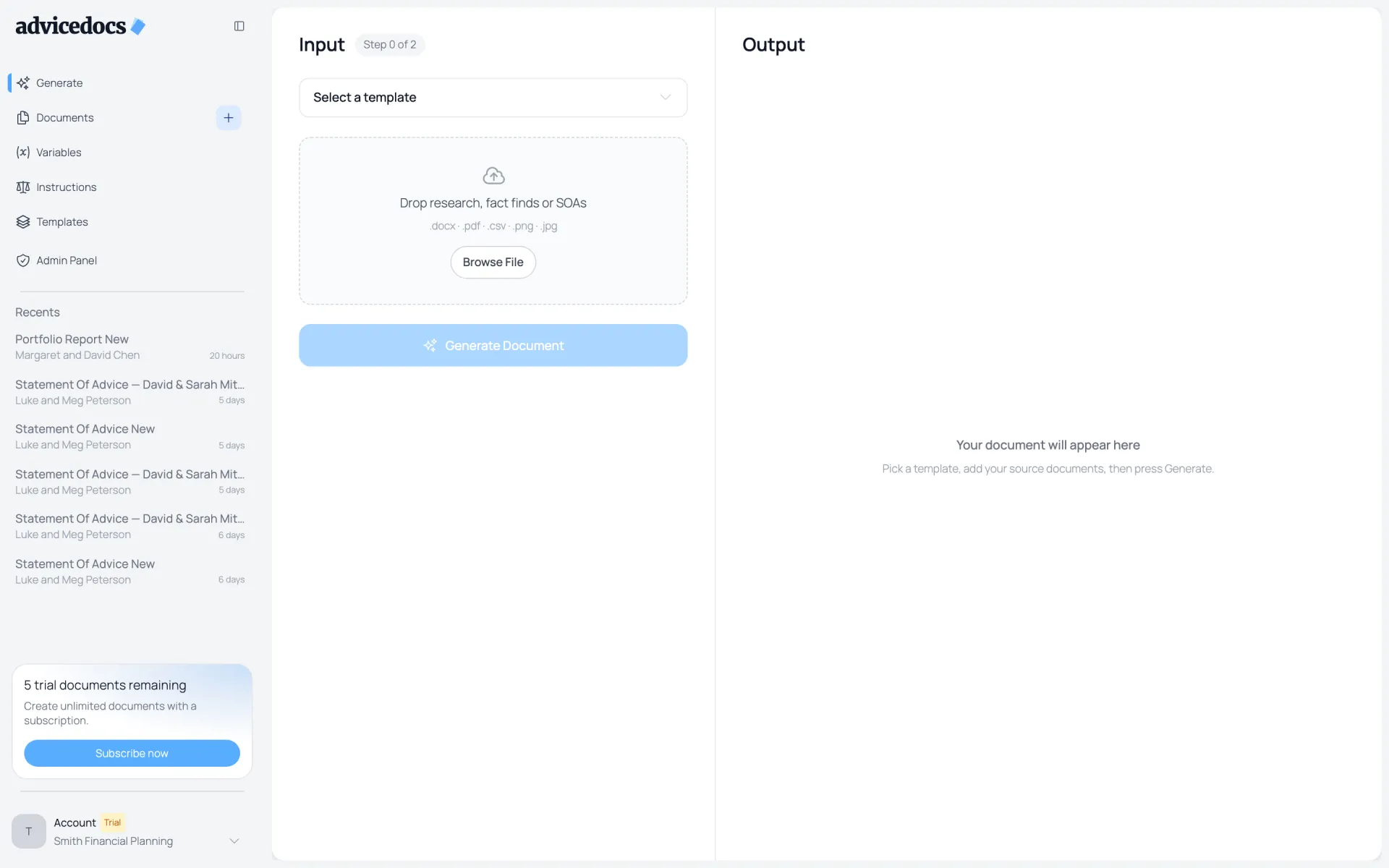
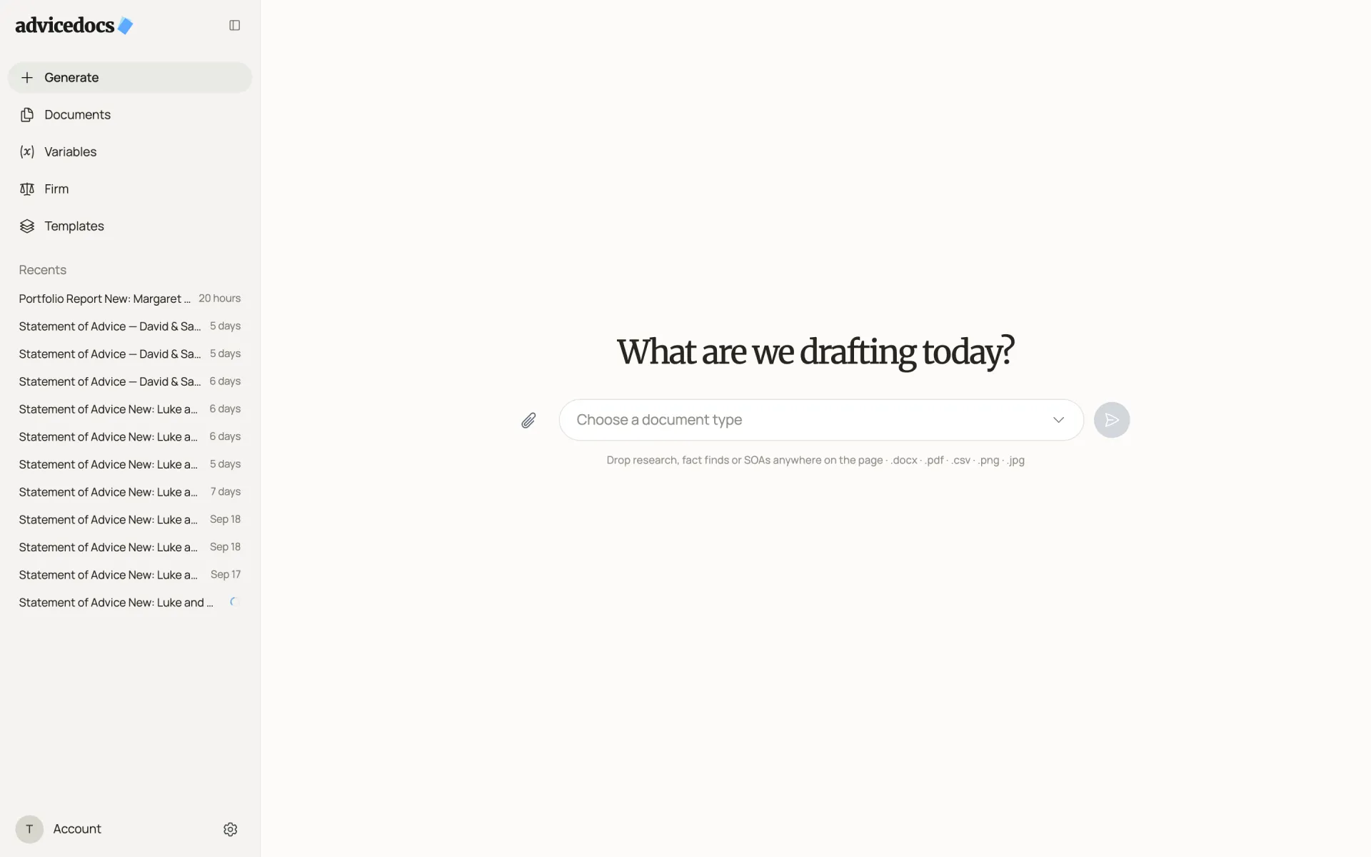
Starting a document used to mean a two-panel screen: pick a template on the left, drop files in a box, press Generate Document, and watch the output appear on the right. Now it is one question — “What are we drafting today?” — with a single field to choose the document type. You can drop fact finds, research or an old SoA anywhere on the page.
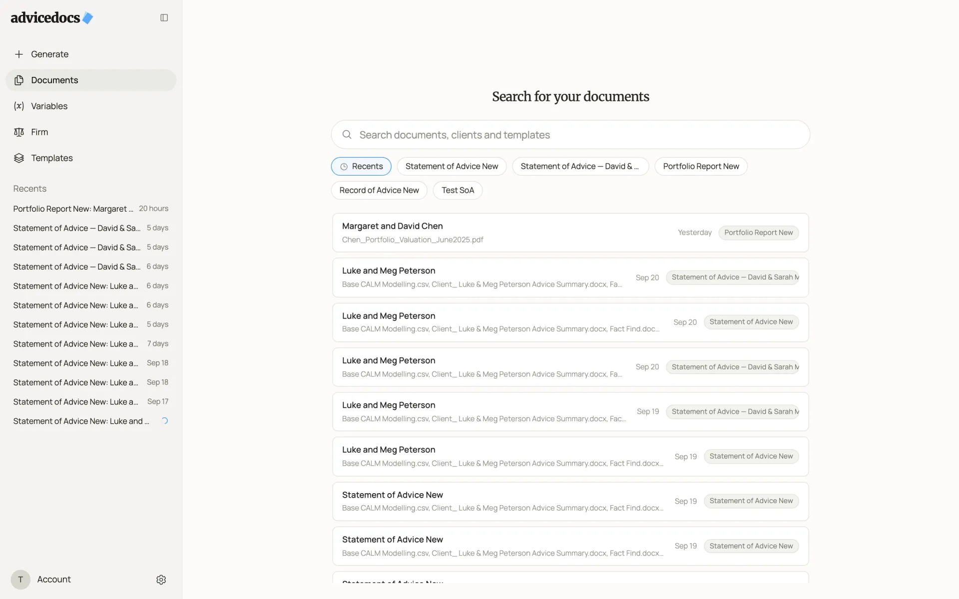
The sidebar is simpler too. Generate sits at the top, followed by Documents, Variables, Firm and Templates. Firm is the new home for what used to be Instructions: your house rules, writing style and asset allocation. Under them, Recents lists your latest documents on one line each, with the client’s name and how long ago the document changed.
A calmer place to work
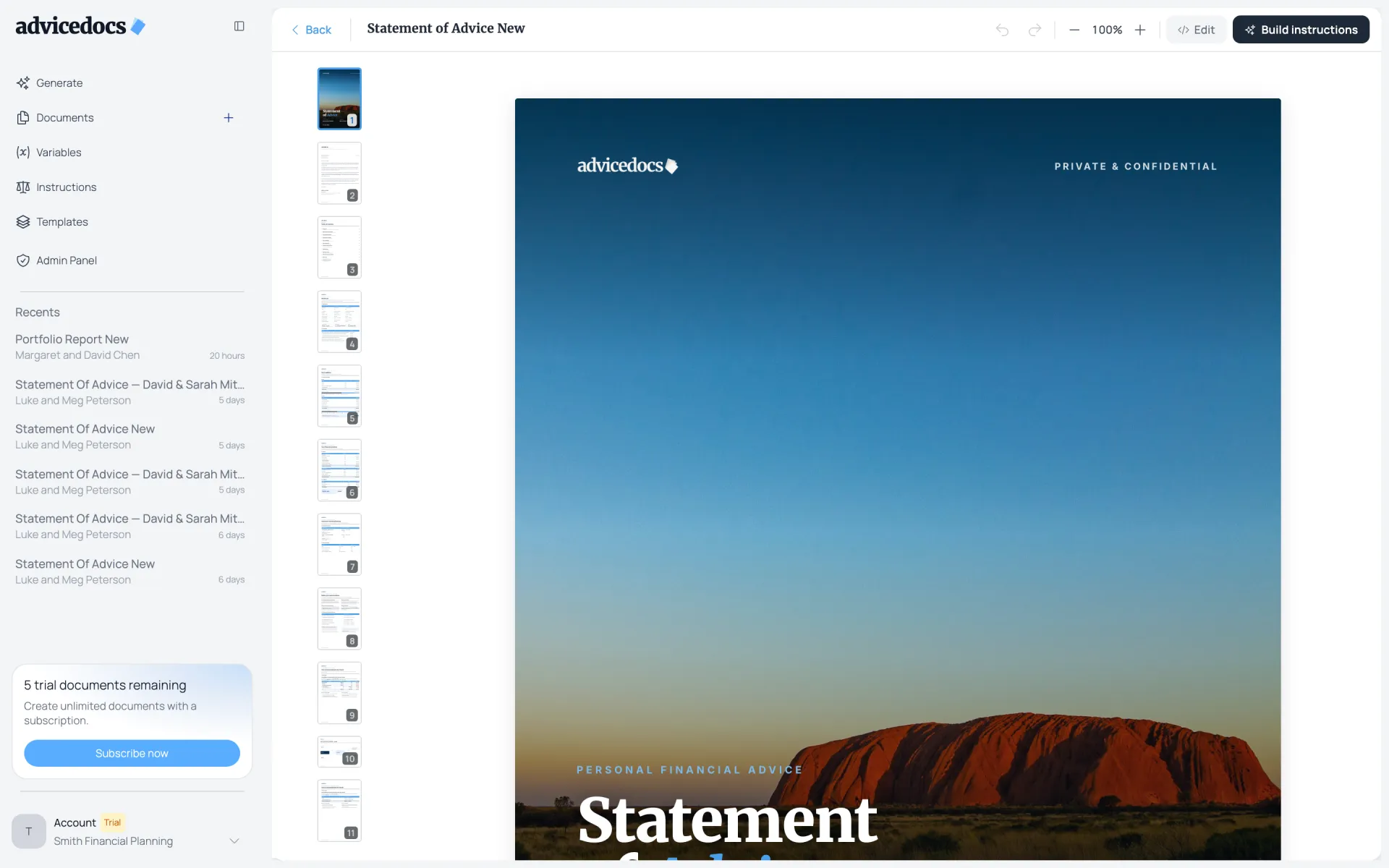
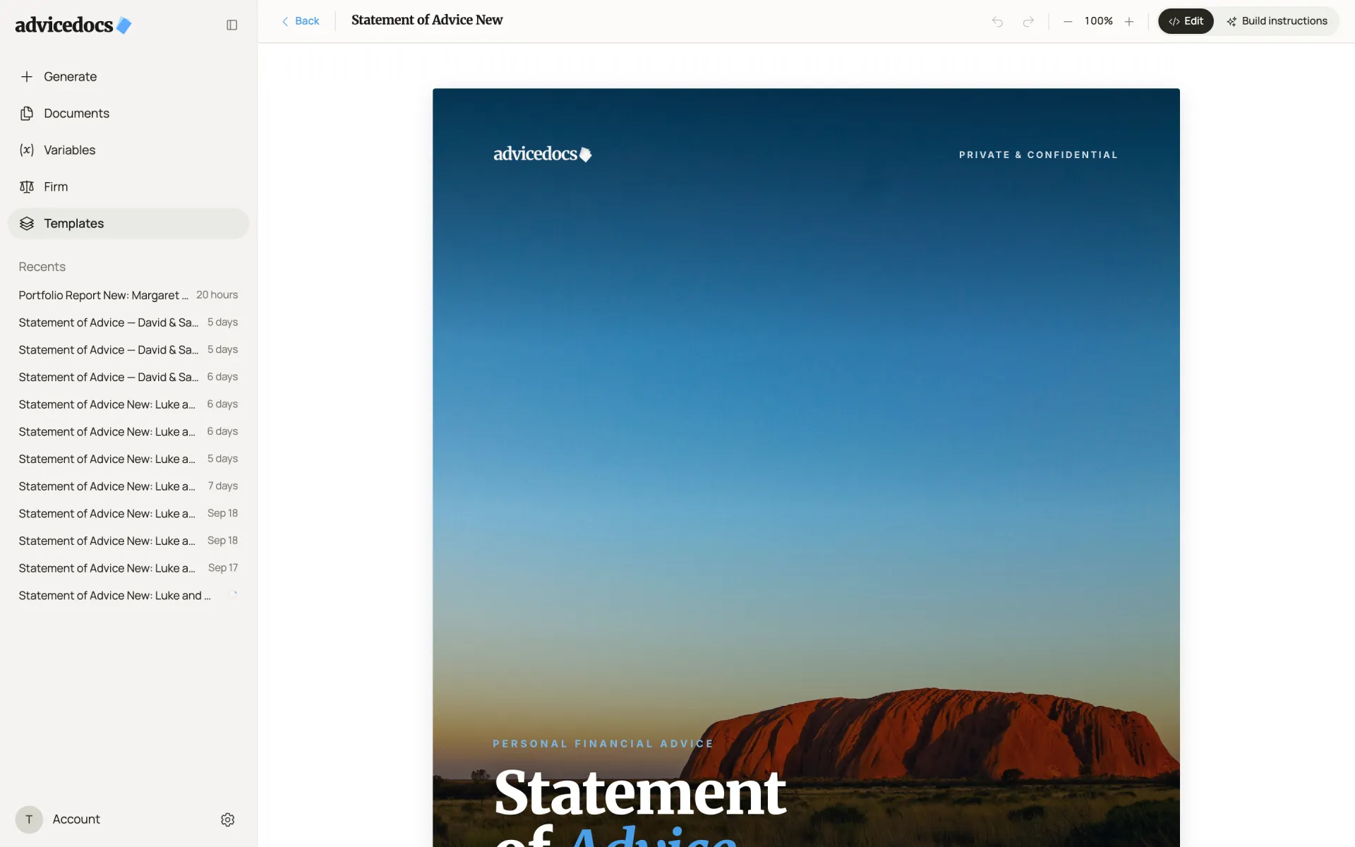
The template editor is where you spend the most time, so we gave the page more room. The column of page thumbnails is gone, and the page now sits centred on a warm, off-white canvas. The toolbar keeps undo, zoom, Edit and Build instructions together in one row. Headings use the same serif type across the app, spacing is consistent from screen to screen, and there is now one loading indicator everywhere, so the app looks and behaves the same wherever you are.
Everything in one place
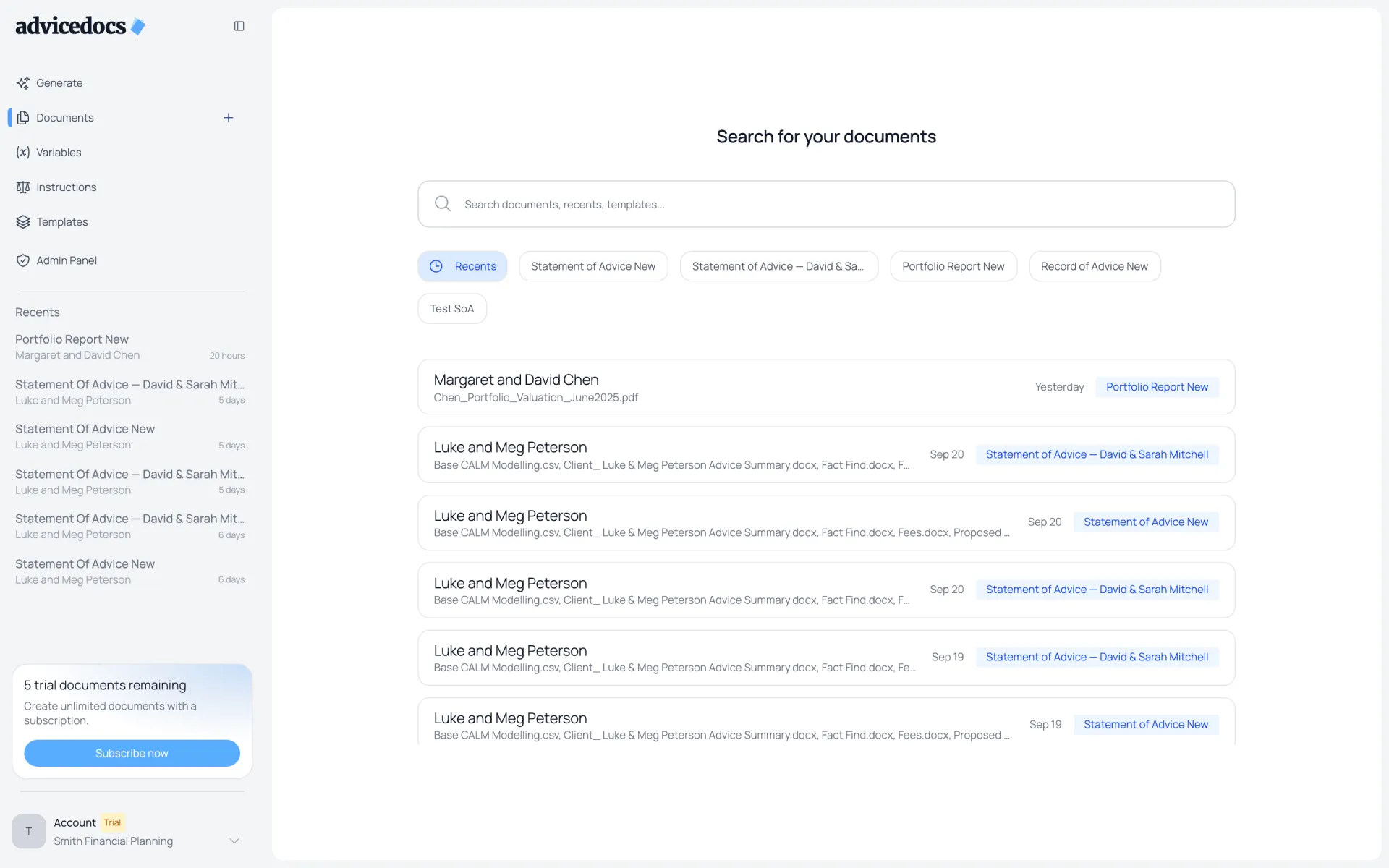
Documents keeps the same job: search everything you have made, filter by template, and open a document where you left it. The search now covers documents, clients and templates in one box, and the list uses the same warm, low-contrast style as the rest of the app, so the client names and dates are what stand out.
Built for what’s next
Behind the new look is one shared set of colours, type and components used by every screen. That matters beyond this release: each new feature we ship will now look and behave like the rest of AdviceDocs from day one, rather than carrying its own style. Everything we release from here is built on it, and we will post each release in these Updates.
If you already use AdviceDocs, log in to see it — there is nothing to set up. If you don’t yet, start a free trial, or read how AdviceDocs works for advisers.
Frequently asked questions
Do I need to do anything to get the new design?
No. The redesign is live for every organisation. Your templates, documents, variables and firm settings carried over unchanged.
Did any features move or disappear?
A few things were renamed or simplified. Instructions is now called Firm and holds your rules, writing style and asset allocation. Starting a document moved from a two-panel form to a single question on the Generate page, and the template editor no longer shows a column of page thumbnails, so the page itself has more room.
Does the redesign change the documents AdviceDocs produces?
No. This release changes the website and the app around your documents, not the drafting itself. Generated documents still use your organisation’s own templates and branding.